Carr Carpentry and Restoration in the News
Carr Carpentry and Restoration was mentioned in the September 4, 2014 Boston Globe article, "Got a tiny kitchen? Try strong colors", by Marni Elyse Katz. This article is featured in the Sept. 7 issue of the Magazine. The original article can be found here.
Got a tiny kitchen? Try strong colors.
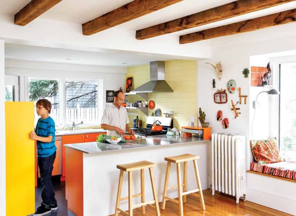
Architect Bill Boehm packs a punch into his 8-by-13-foot space in Cambridge.
By Marni Elyse Katz | SEPTEMBER 04, 2014
Architect Bill Boehm practices what he preaches. Not only does he often punctuate
projects for clients with expanses of bold color (penetrating green kitchens and baths,
and teal, lime, and orange accent walls), Boehm also fearlessly integrates color into his
own home. In fact, when it comes to his newly renovated kitchen, color is a centerpiece.
Boehm and his wife, artist Danielle Sauve, knew when they purchased the 1,600-
square-foot condo in a Cambridgeport multifamily home built in 1840 that the kitchen
would need a major overhaul. The couple, who wanted to stay in the neighborhood (they
and their two children were living just five blocks away), had renovated previous homes
together and were undaunted by another.
The goal was to connect the kitchen, last updated in the 1970s, with the dining room and
instill a sense of airiness, despite the limited square footage, low ceilings, and enclosed
feel. Working with Jamaica Plain-based contractor Carr Carpentry and Restoration,
Boehm took down the wall that separated the two rooms, creating a peninsula to
differentiate the spaces and provide an additional, more casual place to eat. In the dining
area, the radiator was pushed aside to make room for a bay window that looks out onto
the garden, with a window seat underneath.
Fitting the essentials into the 8-by-13-foot kitchen was a challenge. Boehm replaced
sliders with a single glass door to the patio, which allowed the couple to extend the
counter, over which he added a pair of large windows. The oversize enamel sink is bigger
than they had planned for — when Boehm spotted it on the curb in his neighborhood, it
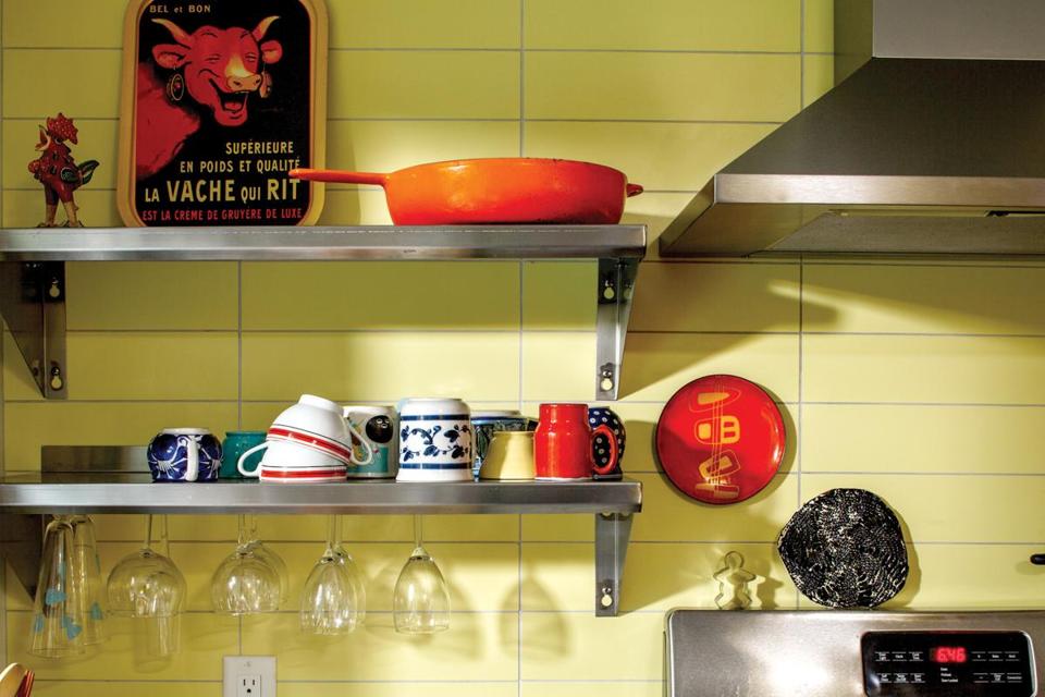
was too beautiful to pass up. Stainless steel shelves from a restaurant supply company
take the place of space-eating overhead cabinets. Finally, they had to forgo the side-byside
fridge they had chosen for a narrower over/under model.
For the room’s palette, the couple were inspired by a photo of a yellow and orange
kitchen with a mod sensibility. “A lot of contemporary kitchen design is white, white, and
white; I like punchy colors in architecture,” Boehm says. He thinks “the enveloping
orange stairwell” in the apartment building where Sauve lived when they met was also
on his mind.
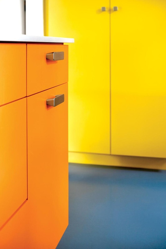
After simulating different pairings in Photoshop, they chose Benjamin Moore Orange
Burst for the base cabinetry and Sun Valley for the pantry cabinets. When he ordered
panel samples for the cabinets from Boston Building Resources in Roxbury Crossing,
Boehm says, “they were like, ‘Are you sure these are the colors you want?’ ”
A third strong color, a saturated blue, comes from the flooring in a 1950s throwback:
linoleum. Available in endless hues and patterns, the material has been making a return
because of its resilience, affordability, and natural, nonchemical makeup.
While others may have been surprised by their choices, the husband and wife were
always in synch. “Other renovations have been more stressful, but this one was never
contentious,” Sauve says. “We work very well together.”
Marni Elyse Katz blogs about design at StyleCarrot.com. Send comments to
magazine@globe.com


